9 Most Common Mistakes Made By Non-Designers
When was the last time you looked at a stunning graphic design and just thought, “Wow. I wish I could do that.”
The great news is that you can! You just need to avoid these common graphic design mistakes so that you, too, can create stunning graphics, even if you’re not a designer.
From social media graphics and website layouts to creating a cohesive grouping of promotional products, there are plenty of opportunities to flex your creative muscles and grow your business at the same time. Whether you’re trying to create a product mockup, designing a new logo, or putting together some print marketing for a new campaign for the first time, creating new artwork doesn’t have to be scary! I’ve put together some of the most common graphic design mistakes and how you can avoid them.
1. Too Many Fonts
The first mistake that stands out when looking at a novice design vs. a professional design is the number of fonts used. Non-designers have a tendency to overdo it by combining too many fonts. This tends to give the design a disorganized and unprofessional look. As fun as it can be to play with fonts to convey different feelings and messages, brands should pick two or three fonts maximum on any design piece.
2. Choosing the Wrong Colors
Similar to using too many fonts, choosing too many colors or choosing the wrong colors can also make a design ineffective. Just because blue and purple are your favorite colors doesn’t mean they will work for your audience. Many times, a project with good communicative potential can go awry if the right colors are not chosen.
3. Using Stock Photos
Stock images can be a helpful and affordable solution when you’re first starting out. However, many common stock photos become used over and over again which makes it a dead giveaway when you put them in your marketing piece. If stock photos are your only option, try sites like (x,y,x) they are technically stock photos, but don’t have that “stock photo” look.
4. Ignoring Visual Hierarchy
Visual hierarchy is how a piece communicates to the viewer the importance of each element in relation to the rest. Hierarchy is the top design technique that ranks the importance of your information. How you create hierarchy in your design will dictate what your audience takes away from it. Hierarchy doesn’t just have to be font size or placement, you can also create effective hierarchy through colors, graphic elements, or the weight of the fonts you use.
5. Hard to Read Text
The goal of good design is not just to be aesthetically pleasing, but to effectively communicate a message. In line with this, text should not only fulfill design goals, but also be easy to read. Placement of text as well as contrast between text and background is important.
6. Poor Readability
Another common mistake is to attempt to fit too many words into one line of text. For readability purposes, 50 to 60 characters per line is the ideal length.
7. Lack of Negative Space
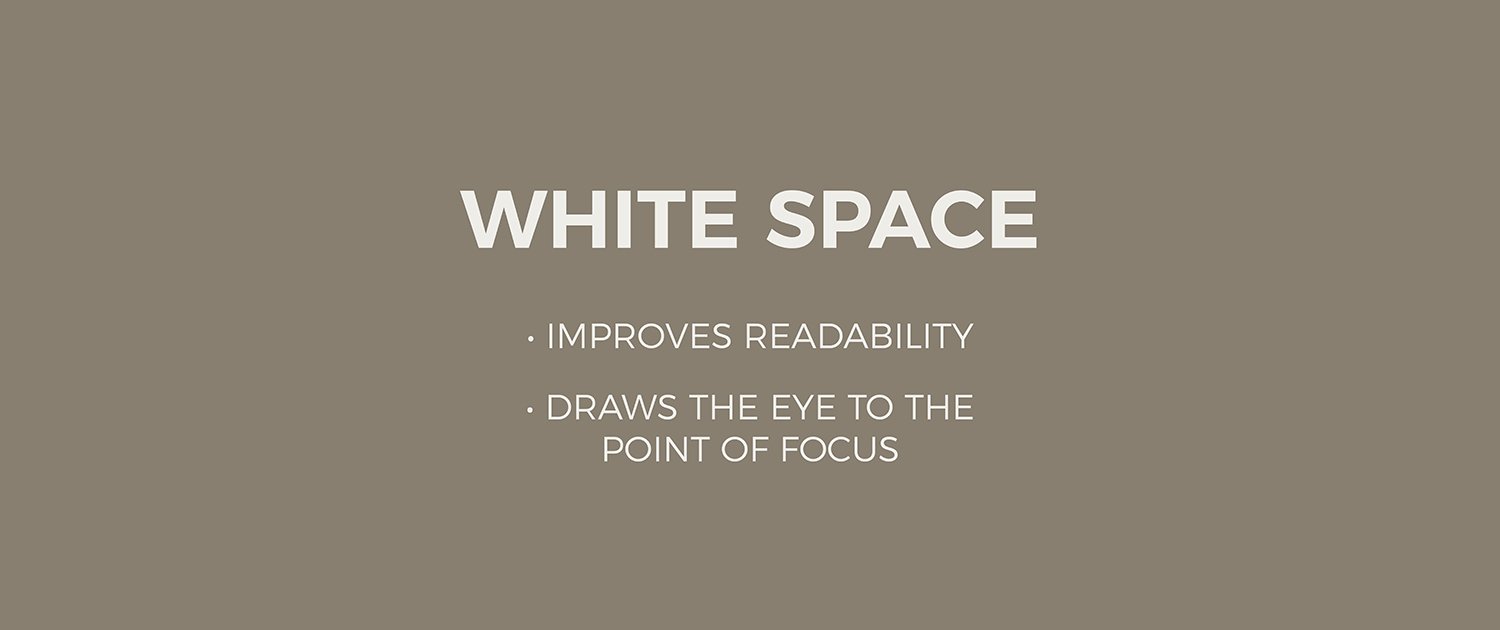
A sure sign of an amateur designer is the lack of white space (or negative space) in a visual design. But instead of looking at white space as empty space, consider it like any other important element of design.
8. Placing CTAs in the Wrong Place
In Western culture, we read top to down and left to right. Keeping this flow in mind can help you make better decisions as to where to place your call-to-action. According to Wordstream, the best place to put your CTA is in the bottom right corner. Why? Because you never want to force users to backtrack in your design in order to click a button.
9. Not Being Consistent
The most common mistake I see non-designers make is the lack of consistency in their designs. You should use the same visual elements (such as image filters or types of buttons) and layouts throughout your project. Consistency looks professional and helps to ensure design work is communicating the intended message. A lack of consistency in design elements, sizes, colors etc can leave people confused and compositions looking messy. Just remember: “Great design is invisible because it’s consistent and familiar.”
While some of the above graphic design mistakes are obvious to the trained designer, many of them are often overlooked by someone who’s not a professional.


